20. June 2023
Neatio Unveils Refreshed Logo

A Symbol of Evolution and Modernity
▸ Introduction:
With this move Neatio, we want to mark a significant milestone in the project evolution, reflecting our commitment to stay at the forefront of technology and design. In this blog post, we will explore the key elements of Neatio’s logo change and the message it provides.
▸ Streamlined Simplicity:
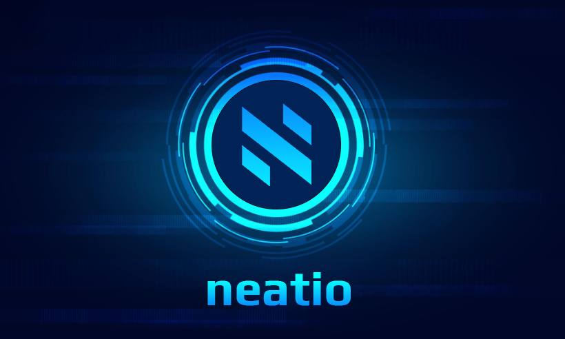
The new Neatio logo embraces the power of simplicity, featuring a cleaner and more streamlined design compared to its predecessor. The intricate details have been stripped away, leaving behind a bold, minimalist symbol. The refined lines and contemporary typography reflect Neatio’s dedication to staying current and relevant in a rapidly evolving digital landscape.
▸ Symbolic Transformation:
At the heart of the logo redesign is the symbol itself. The familiar, stylized letter “N” that has been synonymous with Neatio has undergone a subtle transformation. The refreshed symbol now embodies a sense of forward motion and progress. The new angles of the letter “N” have been subtly modified, giving it a dynamic and modern aesthetic. This change symbolizes Neatio’s continuous drive for innovation and adaptability.
▸ Color Palette:
Accompanying the logo redesign is an updated color palette that infuses vibrancy and energy with 2 gradient shades of blue, lighter and darker. The previous logo of single color have been replaced with a vibrant blue hue that exudes confidence and trustworthiness. The fresh color palette aligns Neatio with the latest design trends and enhances its visual appeal across various platforms.
▸ Brand Consistency:
While the logo has received a contemporary makeover, Neatio remains committed to maintaining its core brand identity and recognition. The new logo retains the essence of the old one, ensuring a seamless transition for our users and preserving the Neatio’s established reputation.
▸ Conclusion:
Neatio’s logo change represents a bold step towards the future, encapsulating the company’s dedication to progress, innovation, and adaptability. The sleek and modern design reflects Neatio’s commitment to staying at the forefront of technology, while the updated color palette infuses a renewed sense of energy. As Neatio continues to evolve, its refreshed logo will serve as a visual representation of the company’s ongoing transformation and its unwavering commitment to providing cutting-edge solutions to its customers.
– Neatio Team –